UX Shit (Still) Happens
My initial excitement about Paper for iPhone turned into disappointment. My favorite sketch App got mutilated on iPad. In Fifty-Three’s effort to create Paper for iPhone some fundamental thinking about usability went wrong killing great user experience on iPad for the sake of iPhone.
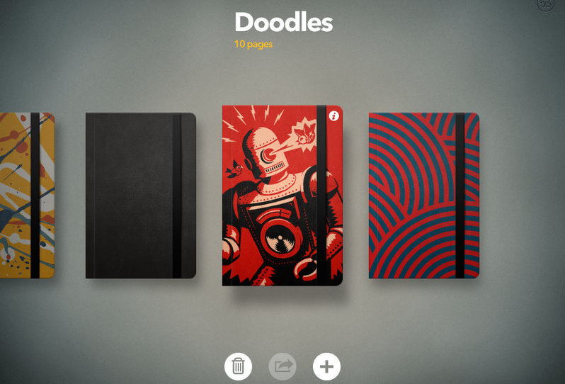


The ’Moleskine’ view that differentiated Paper from mainstream tools such as PowerPoint and Keynote got replaced with Spaces, spaces with covers that actually, well … don’t cover 😦 and the subtle two finger rewind and forward (‘undo/redo’) gesture got replaced with … rewind and forward buttons. Ouch!


“Paper is a universal app that works the same across iPads, iPhones, and iPods that run iOS8+.” – Fifty Three Blog –
The above works well from the viewpoint of efficient code development but is wrong from the viewpoint of usability. iPhones and iPads are **not the same** and are not used in the same way; their usability is different. Before I discuss the usability error made here I would like to share with you what makes great user experience in the first place.

Function – The foundation of great user experience is function. Something must serve a purpose. Things must be useful, add value and have a place in life. ‘Doodling, scribbling, sketching, drawing …’
Quality of Service – Something must be of quality. Quality is more than just the quality of a product. Product quality is obvious. Quality is about quality of service. All services related to a product should be superior and differentiate. ‘The best sketching App, always available with Ninja type support …’
Usability – Things must be easy to use. Usability is more than just ease of use. Often usability is wrongly interpreted as ‘ease of use’. Ease of use is of course key but usability is more than just ease of use. Usability is also about ’use’: use |juz| noun |yo͞os| • a purpose for or way in which something can be used: the herb has various culinary uses. ‘Sketching on iPhone, on iPad …’
Design – Design is not eye candy. Design matters. Good design is both timeless ánd contemporary. Sounds contradicting but it isn’t. Good design adds value. Good design improves marketability. ‘A beautiful sketching App …’

Freude am Fahren – Great user experience is nothing new. Look around. My favorite metaphor for user experience is that of the automotive industry. And within this industry the BMW brand in particular as metaphor for the ‘A-brand’. If you like you can mentally replace BMW with Audi or Volkswagen as respective metaphors for Google, ’Vorsprung durch Technik’, or Microsoft, ’Das Auto’. Whatever you prefer.

A bike, a convertible, a SUV – Three devices. All vehicles. All BMW. Same quality. Same service. Same function. Driving from A to B.

Find the differences – Both are same size SUV’s. Both drive from A to B. Both have 4 wheels and a steering wheel. Quality of Service makes a difference. Basic versus Premium. Both have a place in life and are marketable.

Three different devices – A bike, a convertible, a SUV. All vehicles. All BMW. Same quality. Same service. Same function. Driving from A to B. Despite the same function, the same quality and the same ease of use their usability is completely different. Two wheels less and a different steering wheel make a huge difference for agility; roof and size make a huge difference for passenger capacity. The **use of a function** decides what device needs what functionalities in a particular situation of usage.

Design Matters – Both BMW. Both are same size SUV’s. Both have 4 wheels and a steering wheel. Both drive from A to B. Function is exactly the same. Quality is exactly the same. Ease of use is the same. Their usability is identical. Yet one of them doesn’t sell where the other one actually sells.

Design Timeline – All BMW. All 5-series. Same function. Same quality. Identical usability. Good design is both timeless ánd contemporary. Design requires maintenance. Well maintained design lasts and provides sales retention.
Back to Paper
The below image reflects, metaphorically speaking, Paper for iPad (Video) before last weeks update. I was a happy Paper user experiencing great experiences doodling, scribbling, sketching, drawing and dreaming away whilst showing off this great App and of course some of my work.

I noticed that Fifty Three was about to release Paper for iPhone and I got excited about this next step. Paper for iPhone would come in handy. I had imagined Paper for iPhone to be ‘same function’, ‘same quality’ and ‘different usability’. Basically an agile version of Paper for iPad designed for the same function but different use. Of course I didn’t expect Paper for iPhone to be the same as Paper for iPad. The ‘Moleskine’ views would just be too big for the tiny iPhone screen. So far so good.

But what had meanwhile happened to Paper for iPad ? I did expect an additional use for Paper on iPhone but changing the comfortable convertible I was used to in a bike ??? That I didn’t see coming. I like having both a convertible and a bike because they serve different uses.

I can also see Spaces help me navigating my doodles and sketches but why kill the ‘Moleskine’ view on iPad ? This view was great for presenting and used to be a differentiator for Paper when compared to mean stream stuff like PowerPoint and Keynote.
Freek Beekhuis
Creative Thinker

Thank you, that pretty much sums it up, doesn’t it? I’m riding a gigantic motorcycle the size of an SUV and wondering if it’s just me that feels like an idiot. Their iPhone design works fine on the little screen, but the luxury ride we’re used to on the iPad is just AWOL.